
Overview
Design and development of a music based language learning web application.
Role
-
UX/UI Designer
-
Full Stack Developer
Tools
-
Figma
-
SvelteKit
-
Vercel
-
Supabase
Duration
-
6 months

Background
Music is an immersive way to experience and learn a language. Songs carry rhythm, emotion, and cultural nuance, making them a powerful tool for memorization and engagement. Singing along and working through translations builds a deeper connection to songs, turning study time into something enjoyable and personal.
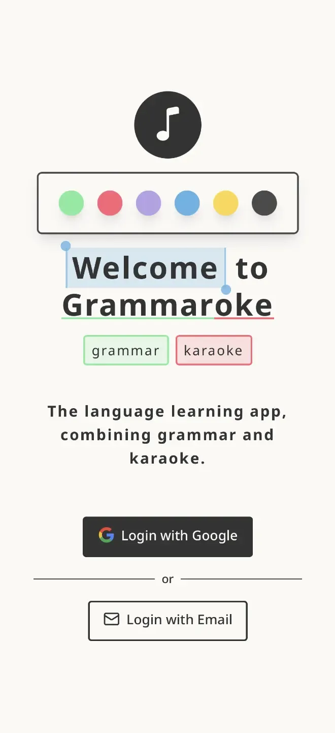
Grammaroke is a language learning web application that combines grammar and karaoke, allowing you to study and sing along with your favorite songs.
Early Approach
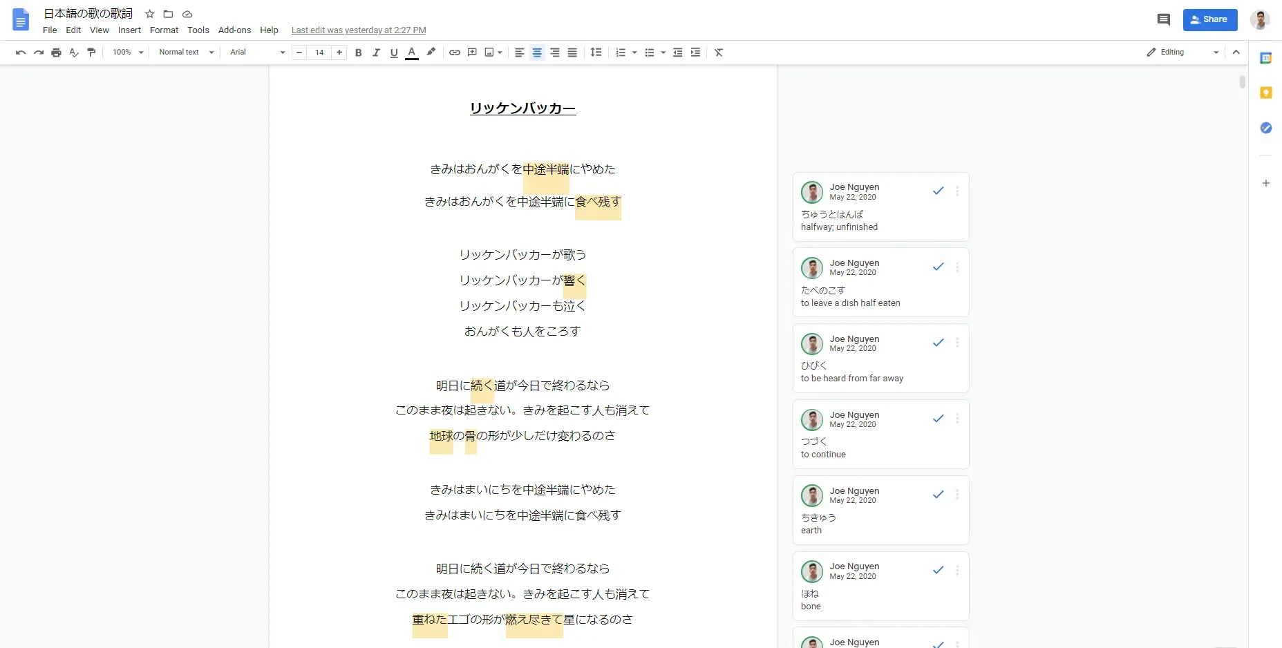
Early on, I captured all my song translations in a single Google Doc. It let me keep everything in one place, add new songs quickly, and use comments for notes. While this approach worked at first, the platform wasn’t built for this kind of workflow, and over time several challenges emerged.
Challenges
-
Large number of comments made the document slow to load and stutter during use.
-
Comments were displayed off to the side, making it difficult to connect them with the corresponding text.
-
No distinction between the "current line" and the rest of the lyrics.
-
Page had to be manually scrolled to keep up with the song.
-
Navigating between songs became a hassle.
Inspiration
The design of Grammaroke was influenced by several sources, including online language lessons, lyrical music videos, and note-taking and annotation apps.
-
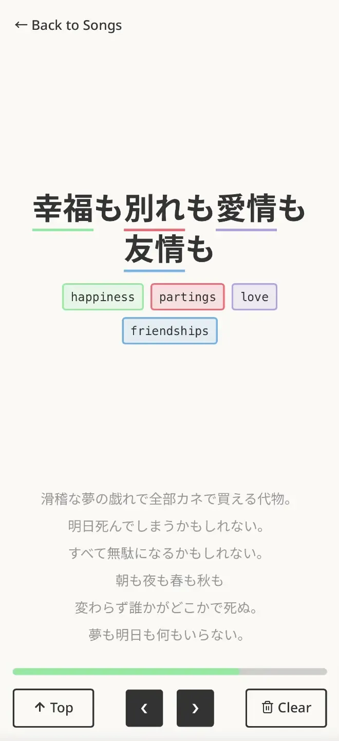
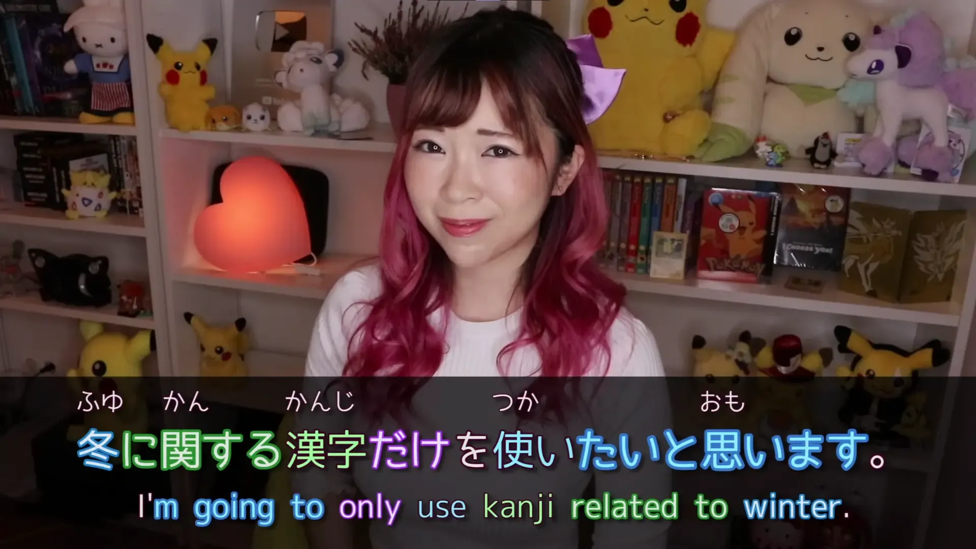
Misa from Japanese Ammo illustrated effective use of color to connect words with their definitions and relevant grammar points, showing how visual cues can enhance comprehension.
-
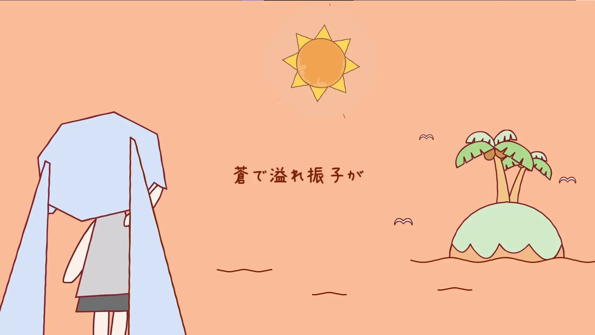
iA Writer inspired the minimalistic UI and focused reading experience, using techniques like blurring adjacent text to help users stay centered on the current line, similar to how lyrics are presented in music videos.
-
Google Docs demonstrated how easy it is to work with large bodies of text while adding annotations quickly through highlighting and commenting.
Early Designs
Highlight Colors
Neutral Colors
The goal was to create a simple and casual design, combining a soft background with bright highlights to draw attention to key elements.
Redesigns due to Development
As development began, a number of changes were made to simplify the experience and focus on the minimum viable product (MVP). A big focus was given on form and functionality, with visuals and branding coming later on.
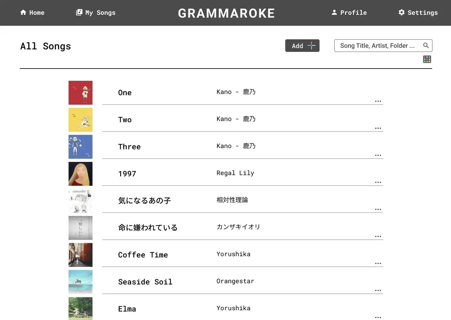
Songs Page
The original design of the songs page emphasized visuals, including options to upload album art and switch between grid and list views. These features were ultimately removed for the following reasons:
-
Uploading album art was a clunky workflow for users.
-
Images consumed unnecessary storage space.
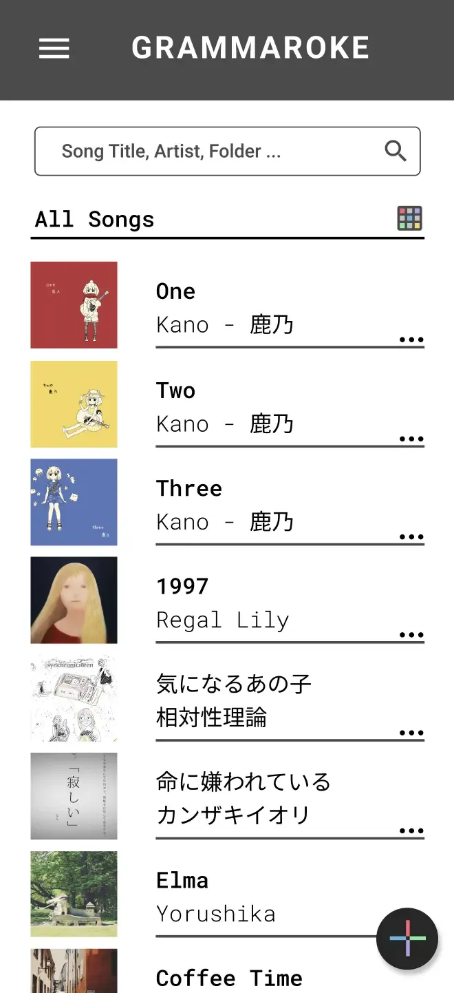
The current songs page is much simplier, displaying only the artist name and title. It also has flushed out features such as the ability to create and group songs by folders.
Annotations Page
The annotations page underwent significant revisions to improve usability, especially on mobile devices:
-
The "current line" of lyrics was give much more room to display boldy on the page.
-
The “previous lyrics” section at the top was removed and the "remaining lyrics" tighten. This again provided more room to display annotations.
-
The original scrolling-only input was replaced with buttons for navigation, making the interface easier to use.
-
A new controls section at the bottom introduced common actions such as “Back to Top” and “Clear Annotations.”
-
The toolbar, text editing, style guides, and undo/redo features were cut as non-MVP functionality.
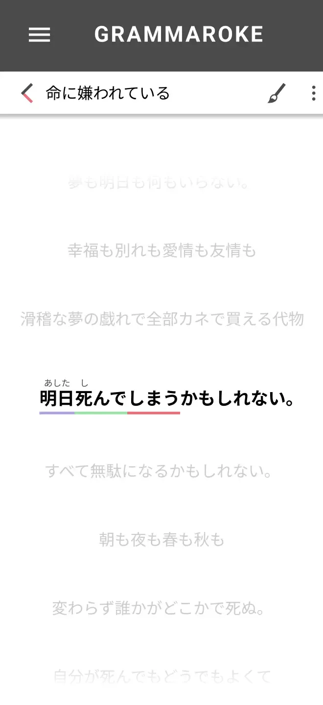
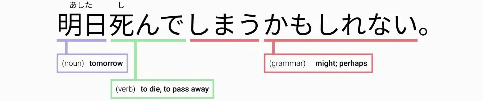
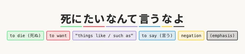
Annotations Display
The way annotations appeared was also simplified and improved upon:
-
Early designs included hover states, pinned states, extension lines connecting words to notes, and color-coded prefixes to indicate word type (verb, noun, adjective, etc.).
-
These features were removed due to technical complexity and limited value for the MVP.
-
Annotations now display inline beneath the lyrics, creating a simpler and more reliable experience, without the need for complex positional calculations.
Tech Stack
The project began in Next.js but was later refactored to SvelteKit, as an opportunity to learn a new framework.

-
Styling & Components: Built with Tailwind CSS, applying Atomic Design principles to create reusable components.
-
Hosting & Database: Hosted on Vercel with Supabase powering the backend database.
-
Full-Stack Development: Implemented user authentication, designed relational database tables, and built API requests to save songs and annotations.
-
AI-Assisted Development: Leveraged tools such as GitHub Copilot and Claude to accelerate coding and problem-solving.
This project was an end-to-end full-stack project, expanding beyond frontend UI into backend architecture and deployment.
Next Steps
The app is now live, but in a quiet, closed alpha. As I continue to refine features and polishing the experience, I use it for my own language learning. This hands-on use helps me catch bugs, uncover usability challenges, and discover opportunities for improvement, ensuring the app is well-tuned before reaching a wider audience.